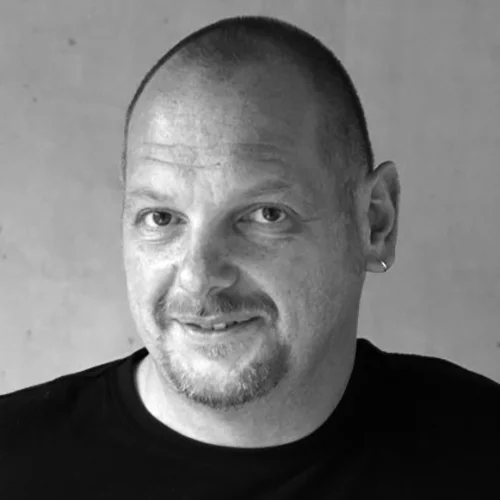
Hubert Jocham
After his education in leadsetting Hubert Jocham studied graphic design in Augsburg (Germany) and Preston in the north of England. His degree project was about the history of italic printing type of the Renaissance. In 1998 he moved to London and worked for Henrion in corporate branding, designing brandmarkes followed by complex design manuals. During that time he also designed headline and text typefaces for british magazines like FRANK and ARENA.
Today Hubert Jocham is designing brandmarks for most of the leading branding Networks like Interbrand, The Brand Union, Landor or Futurebrand. He develops text and headline systems for international magazines like GQ London, russian, turkish and french Vogue, L'Officiell Paris, Details and W magazine in New York and now even german magazine publishers like Gruner & Jahr. He is also responsible for the corporate typefaces of Bally in Switzerland, for the Kunsthaus Graz, Agfa Photo and just implemented Vattenfall in Sweden.
BITS MMX Special Workshop
Hubert Jocham
Narrated by Pongtorn Hirunpruek
October 30, 2010.
1.00 pm. - 5.00 pm.
Alliance française de Bangkok
Available slots : 10 person
BITS MMX International Conference
Hubert Jocham
Narrated by Mali Jaturajinda
October 31, 2010.
Afternoon session
Alliance française de Bangkok
"Typographic Logo"
When people think of logos they often think about a symbol like the Nike swoosh or Apple. As if it is the best thing for a brand to have one of those symbols. Still many brands do not have one. Some are only typografic, some even just Helvetica. So what is a good brandmark? Is it a symbol or a logotype?

